

Baseball Card Redesign
Role: Senior User Experience Designer
A case study examining the reinvention of a primary analytics and reporting feature through small incremental improvement over a years time. Teacher adoption increased 11% in 2023.
Problem & hypothesis
Performance Matters is an assessment and analytics software provider for K-12 schools nationwide. ‘Baseball Card’ is one of the most heavily used features within its assessment platform.This feature allows a user to identify patterns and behaviors through triangulates using the student, location, and an academic measure. With this information, school districts are able to identify and predict student outcomes early on, and allocate the appropriate resources. Despite its robust functionality, Baseball Card had a few major problems:
The backend architecture of the feature was closely tied to the UI making it difficult to change or improve. Baseball Card had been left for years without crucial workflow updates and a dated UI. A complete refactor was needed to decouple the UI from the backend, and to account for larger school districts, and data. We also needed to update to the Powerschool Design System (PDS). Our currently CSS ecosystem was…in-page spaghetti.
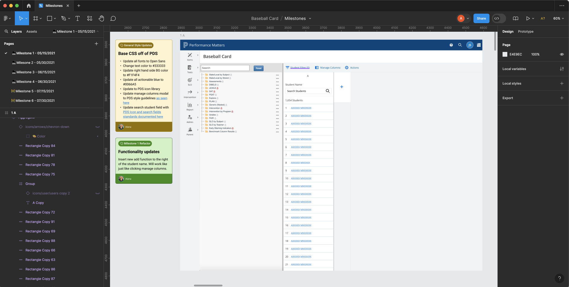
Baseball Card before the redesign:
RESEARCH
AFFECTED PERSONAS

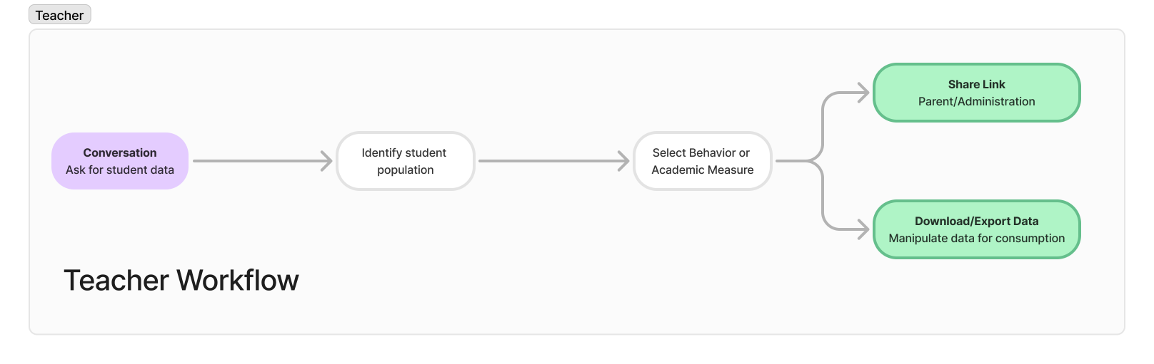
Teachers
Name: Linda Robinson
Quote: "Teaching isn't just a job—it's a labor of love and a chance to make a difference every day."
Related Primary Tasks and Goals:
• Arrive before the students and prepare materials
• Deliver instruction, and measure student progress
• Communicate with parents and staff
Pain Points:
• Time.
• Lack of resources and tools.
• Technology doesn’t account for developmental level of all students.
• Late assignments and make up work turned in during end of term grading.
• Professional development mandated by the district misses the mark
Technology Comfort Level
5. Moderate level of comfort
Primary Mediums
Laptop, Tablet, Phone

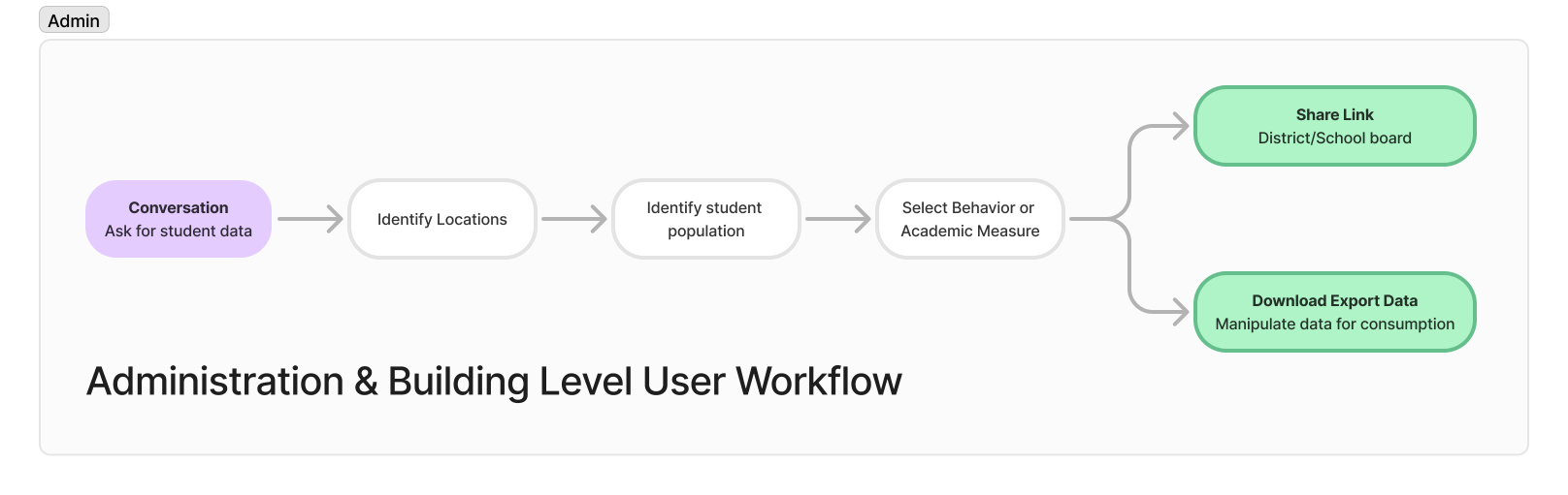
Adminsitrator
Name: Michael Robinson
Quote: "It's all about balancing budgets and meeting benchmarks."
Related Primary Tasks and Goals:
• Analyze data and provide reports, including custom and state reports
• Troubleshoot issues including requests for resources, training opportunities, or user/ system errors
• Set up registration and master schedules
Pain Points:
• Constant interruption when trying to complete tasks
• No downtime throughout the year
Technology Comfort Level
9. High level of comfort
Primary Mediums
Laptop, Phone, Tablet

Building Level User
Name: Janet Aire
Quote: "I believe in people over paper - my people come before my to-do lists."
Related Primary Tasks and Goals:
• Arrive before the students and check schedule/ prepare task list for the day.
• Run reports based on the ABCs – Attendance, Behavior, and Courses – and compliance requirements.
• Conduct Formal Observations and Informal class walkthroughs - Provide teachers feedback in a timely manner.
• Communicate with parents via phone, email, or face-to-face meetings.
• Handle building maintenance issues and requests.
Pain Points:
• Constant interruption when trying to complete tasks
• Time
Technology Comfort Level
9. High level of comfort
Primary Mediums
Laptop, Phone
INTERVIEWS
Method: 1:1 Interviews
A small group of super users (Administrators, Building Level Users, and Teachers) were identified through Pendo data and sent and invite for a 1:1 interview. Pendo click maps had also been applied to Baseball Card, we pulled the previous year’s data to help identify existing crucial functionality. Participants were interviewed and asked to identify the pain points of current workflows.
Insights and Analysis
Using Miro, the responses were affinity mapped and insights were defined. The results were shared with Product and Development. Accessibility and responsive / mobile requirements were defined at this stage.
Key Insights:
Make functionality easier to consume, and discoverable
Associate managing columns and measures closely, functioning similarly or the same.
Swatching interaction doesn’t behave as expected.
Transparent viewing permissions
Sharing should be located at the end of process
Saving combinations of complex filtering, allowing for some customization of the UI
Incorporate data processing functions where it makes sense (AVG, SUM of columns / rows etc.)
Comparison chart has low usage. Consider updating this feature to be independent of the main Baseball card UI
Low adoption rate from teachers
Heavy training required from the district to use baseball card
UI is intimidating to new users
This process is never conducted on a mobile device
Current design isn’t responsive

THE SOLUTION
HYPOTHESIS & USER WORKFLOWS
We believed that by redesigning the ‘Baseball Card’ analytics feature to simplify the user interface and enhance teacher engagement, we would improve usability and increase adoption among teachers. We assumed that removing clutter and adding essential shortcuts would lead to a better understanding of student performance and more efficient workflows. We aimed to validate this by measuring user engagement and gathering feedback post-implementation.
Two very similar major workflows were identified from the interviews. One pertaining to teachers, and the other administration and building level users.
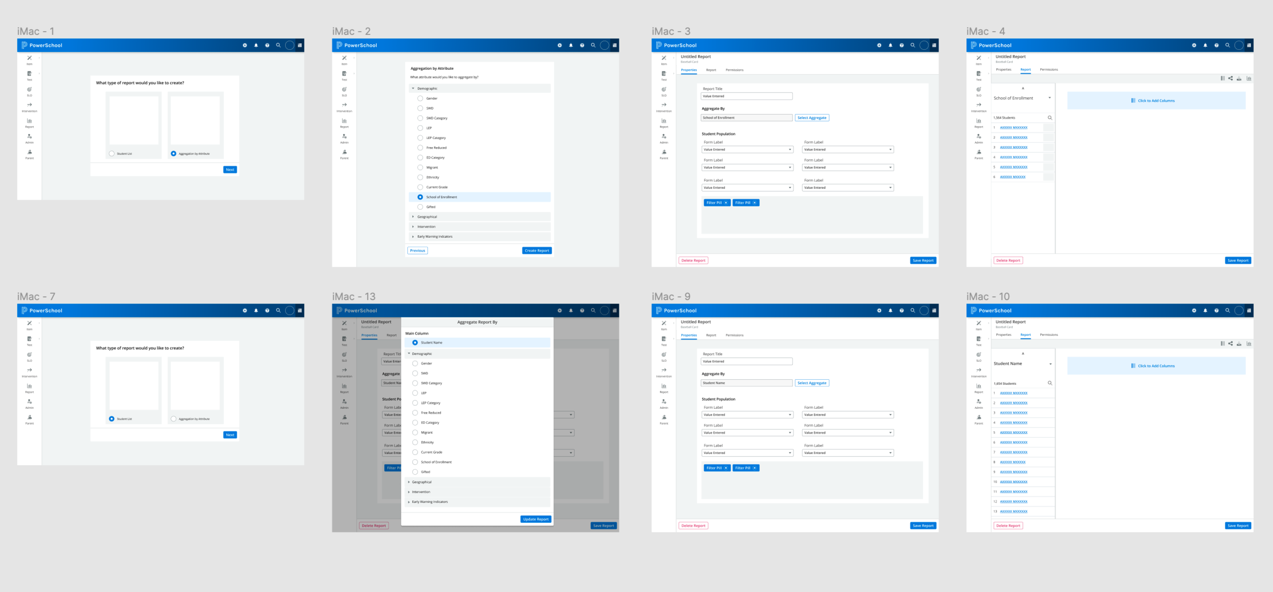
IDEATION AND WIREFRAMES
Wireframes and alternate workflows were generated with Product and Development from those findings using Sketch. We explored removing the manage columns workflow from the main UI. I also conducted an analysis of the current components used in PDS and compared them to the current functionality of Baseball Card.
PROTOTYPES AND COGNITIVE WALKTHROUGHS
Prototypes of the new workflows were developed and shown to a small group of users in cognitive walkthroughs. The feedback was affinity mapped in Miro and applied to the designs.
Accessibility, and mobile / responsive issues were explored during this phase. The overall grid would be completely navigable by keyboard, aria labeling identified, and using the new, completely accessible color pallet.
HIGH FIDELITY
Baseball Card after the redesign:
CONCLUSION
SLOW ITERATIVE IMPLEMENTATION
The final prototype was agreed upon between Product, Design and Development. We then discussed how we might update this crucial feature without completely disrupting our current users’ workflows. The slowest months for the platform are during the summer. Staff typically take summers off. We decided that development would begin in May. Striving for a truly Agile development cycle, the final design was chopped into milestones reflecting small incremental changes to overall behavior and UI over a year, resulting in the eventual complete redesign.
We also needed to adopt brand new design system, and our existing CSS was written in-page; not controlled globally. Performance Matters as a whole would need to rewrite their front end in order to adopt the new design system. The Baseball Card feature would be the first experiment in this effort. It was decided that with each iteration we would improve the health of the CSS within Baseball Card, slowly. We would “fake” the implementation of PDS until the very last cycle, making components look like PDS but not actually use the PDS development library until the last iteration in May of 2022. We would start with the lowest hanging fruit stylistically, and add one new feature per development interation.
Example Iterations
Milestone 1: We would change the appearance of basic elements of the page, (Fonts, colors, and buttons) and introduce one new major function, the ability to add a new column from the main UI. We would remove the Comparison Chart function to a new actions button.
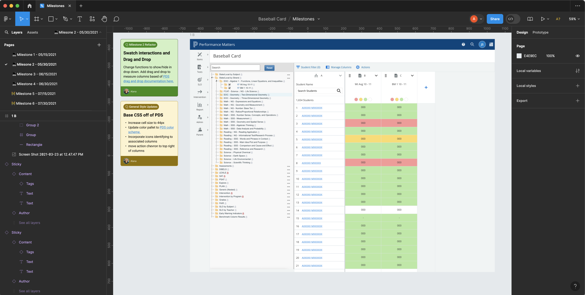
Milestone 2: Columns were net on the list. We would update their appearance to be PDS compliant, increasing cell height and implementing new measure color pallets. Swatch interactions would be made to be more intuitive and we would introduce the ability to drag and drop columns.
BUSINESS IMPACT
Baseball Card accounted for 1.1 million in revenue for Performance Matters. After the redesign, Performance Matters was able to retain all existing RFPs. An additional 250 thousand in ROI was added in 2022. Teacher adoption and use of Baseball Card increased 11% by 2023.